

New! Render PlantUML diagrams directly inside GitHub
with our official browser extension —
No server. No tokens. No tracking. Zero permissions but clipboard. —
Try it out and let us know what you think!
Component Diagram
Component Diagram: A component diagram is a type of structural diagram used in UML (Unified Modeling Language) to visualize the organization and relationships of system components. These diagrams help in breaking down complex systems into manageable components, showcasing their interdependencies, and ensuring efficient system design and architecture. Advantages of PlantUML: Edit in Dokuwiki
 Edit in Asciidoc
 Edit in Markdown
- Simplicity: With PlantUML, you can create component diagrams using simple and intuitive text-based descriptions, eliminating the need for complex drawing tools.
- Integration: PlantUML seamlessly integrates with various tools and platforms, making it a versatile choice for developers and architects.
- Collaboration: The PlantUML forum offers a platform for users to discuss, share, and seek assistance on their diagrams, fostering a collaborative community.
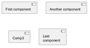
 Components
Components must be bracketed.
You can also use the component keyword to define a component. In this case the brackets can be omitted, but only if the component name does not include white-space or special characters.
You can define an alias, using the as keyword.
This alias will be used later, when defining relations.
Naming exceptions
Note that component names starting with$ cannot be hidden or removed later, because hide and remove command will consider the name a $tag instead of a component name. To later remove such component they must have an alias or must be tagged.

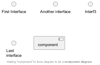
Interfaces
Interface can be defined using the () symbol (because this looks like a circle).
You can also use the interface keyword to define an interface.
And you can define an alias, using the as keyword.
This alias will be used latter, when defining relations.
We will see latter that interface definition is optional.
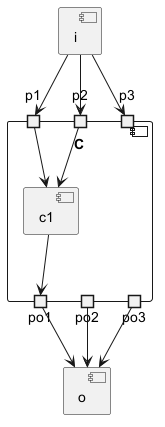
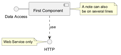
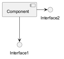
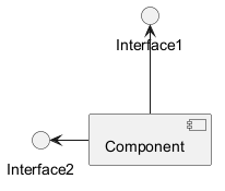
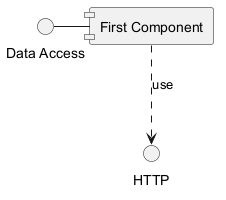
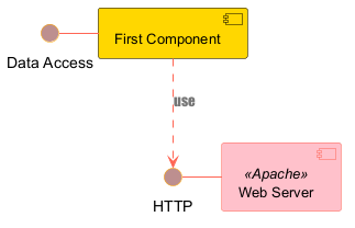
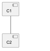
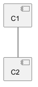
Basic example
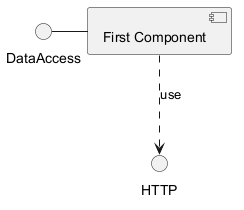
Links between elements are made using combinations of dotted line
(..), straight line (--), and arrows (-->)
symbols.
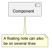
Using notes
You can use the
note left of , note right of ,
note top of , note bottom of
keywords to define notes related to a single object.
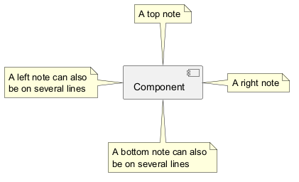
note
keywords, then linked to other objects using the .. symbol or whatever arrow symbol (-, --, ...).
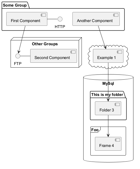
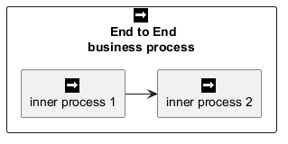
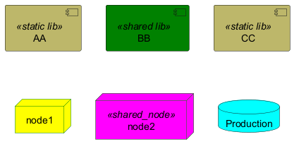
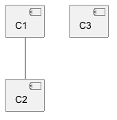
Grouping Components
You can use several keywords to group components and interfaces together:
packagenodefolderframeclouddatabase
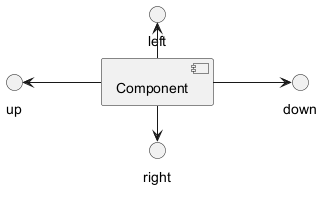
Changing arrows direction
By default, links between classes have two dashes -- and are vertically oriented.
It is possible to use horizontal link by putting a single dash (or dot) like this:
left, right, up
or down keywords inside the arrow:
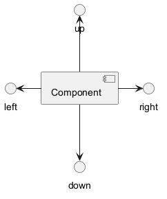
-d- instead of
-down-)
or the two first characters (-do-).
Please note that you should not abuse this functionality : Graphviz gives usually good results without tweaking.
And with the left to right direction parameter:
Use UML2 notation
By default (from v1.2020.13-14), UML2 notation is used.

Use UML1 notation
The skinparam componentStyle uml1 command is used to switch to UML1 notation.
Use rectangle notation (remove UML notation)
The skinparam componentStyle rectangle command is used to switch to rectangle notation (without any UML notation).

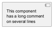
Long description
It is possible to put description on several lines using square brackets.
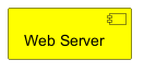
Individual colors
You can specify a color after component definition.
Using Sprite in Stereotype
You can use sprites within stereotype components.
Skinparam
You can use the skinparam
command to change colors and fonts for the drawing.
You can use this command :
- In the diagram definition, like any other commands;
- In an included file;
- In a configuration file, provided in the command line or the Ant task.
Specific SkinParameter
componentStyle
- By default (or with
skinparam componentStyle uml2), you have an icon for component
- If you want to suppress it, and to have only the rectangle, you can use
skinparam componentStyle rectangle
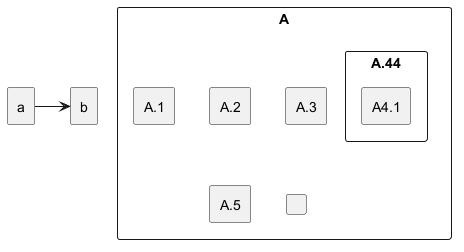
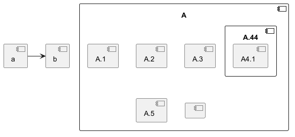
Hide or Remove unlinked component
By default, all components are displayed:

hide @unlinkedcomponents:
- or
remove @unlinkedcomponents:

Hide, Remove or Restore tagged component or wildcard
You can put $tags (using $) on components, then remove, hide or restore components either individually or by tags.
By default, all components are displayed:
hide $tag13components:
- or
remove $tag13components:

- or
remove $tag13 and restore $tag1components:
- or
remove * and restore $tag1components:

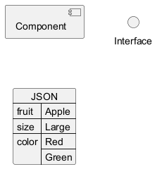
Display JSON Data on Component diagram
Simple example
Port [port, portIn, portOut]
You can add port with port, portinand portout keywords.
Port

PortIn
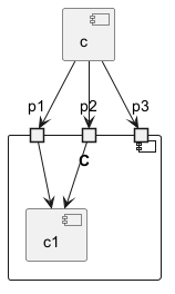
PortOut
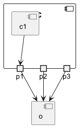
Mixing PortIn & PortOut