New! Render PlantUML diagrams directly inside GitHub
with our official browser extension —
No server. No tokens. No tracking. Zero permissions but clipboard. —
Try it out and let us know what you think!
Chart Diagram
Starting with version 1.2026.0, PlantUML includes support for chart diagrams, enabling you to create several types of charts directly within your PlantUML documents. Supported chart types include bar charts, line charts, area charts, and scatter plots. The feature also offers advanced styling options, multiple axes, annotations, and full integration with the PlantUML style system. This new functionality is made possible thanks to the excellent work of David Fyfe, whom we warmly thank for his contribution. This document is an adapted copy of the original documentation available here. [Ref. GH-2440] Simple Example
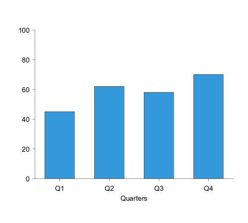
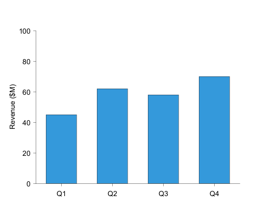
A simple bar chart is created using the @startchart and @endchart keywords:
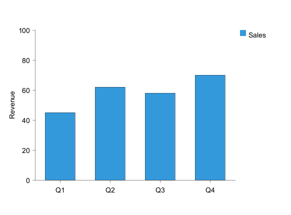
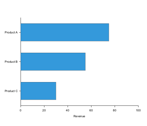
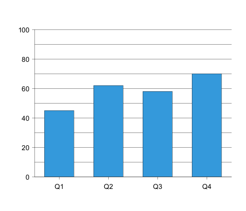
Bar Chart
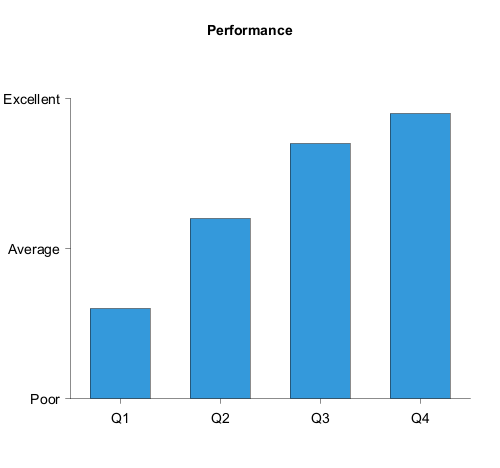
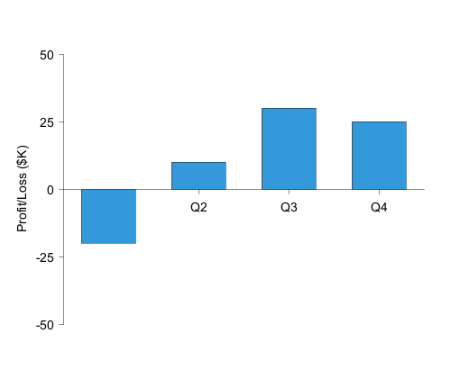
Bar charts display data as vertical or horizontal bars. Use the bar keyword to create a bar series:
Grouped Bars
Multiple bar series are displayed side-by-side by default:

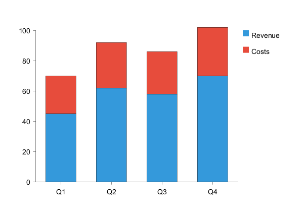
Stacked Bars
Bars can be stacked on top of each other:
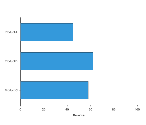
Horizontal Bars
Bars can be oriented horizontally:
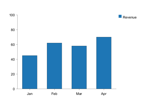
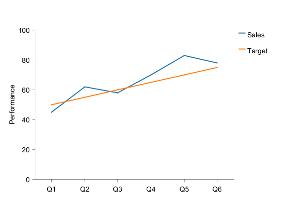
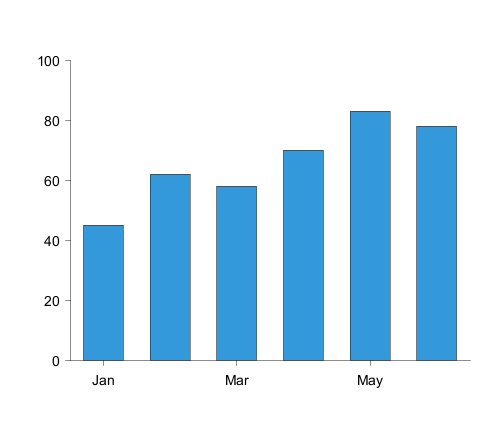
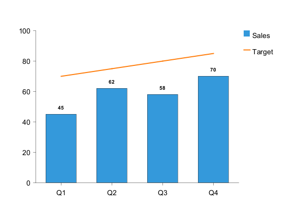
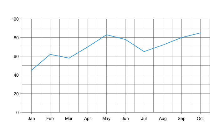
Line Chart
Line charts connect data points with lines. Use the line keyword:
Coordinate-Pair Notation
Line and scatter charts support an alternative coordinate-pair notation for plotting data at specific x-coordinates. This is useful for mathematical functions, irregular data points, or when you need precise control over point positioning. Syntax:[(x1,y1), (x2,y2), (x3,y3), ...]
Requirements:
- Only supported for
lineandscatterchart types - Requires numeric h-axis with explicit range (e.g.,
h-axis "x" -5 --> 5) - NOT compatible with categorical h-axis (e.g.,
h-axis [Q1, Q2, Q3, Q4]) - All series in a chart must use the same format (either all coordinate pairs or all index-based)
- X-coordinates must fall within the h-axis range
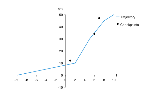
- Line charts connect points with straight line segments
- Scatter charts display individual markers at each coordinate
- Points can be unevenly spaced along the x-axis
- Gaps between points are left empty (no interpolation)
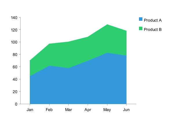
Area Chart
Area charts are similar to line charts but with filled regions:
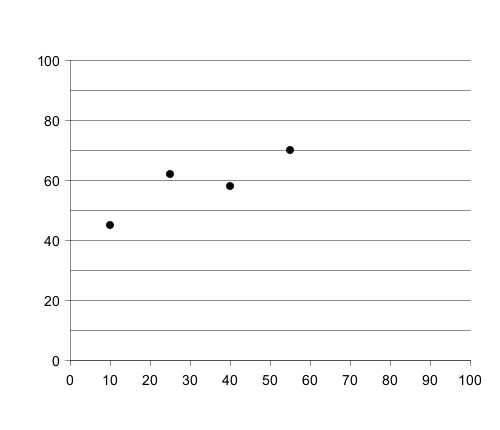
Scatter Chart
Scatter plots display data as individual points with customizable marker shapes:
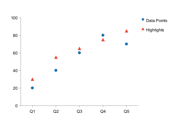
circle(default)squaretriangle
MarkerColor, MarkerShape, and MarkerSize properties in a style block. This provides the most reliable color and shape control
Axes Configuration
Horizontal Axis
The horizontal axis (x-axis) is configured using theh-axis keyword:
Vertical Axis
The vertical axis (y-axis) is configured using thev-axis keyword:

Secondary Y-Axis
A secondary v-axis (v2) can be added on the right side for dual-scale charts: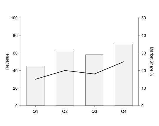
v2 flag in series commands to bind them to the secondary axis.
Axis Label Positioning
By default, axis labels are positioned as follows:- V-axis labels: vertically along the left side (reading bottom-to-top)
- V2-axis labels: vertically along the right side (reading top-to-bottom)
- H-axis labels: horizontally below the axis (centered)
label-top and label-right options:
V-Axis with label-top
Position the v-axis label horizontally at the top: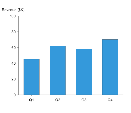
H-Axis with label-right
Position the h-axis label at the far right: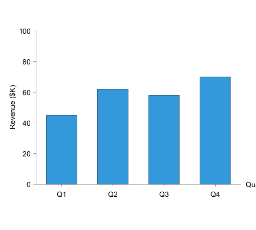
Combined Label Positioning
You can combine both options for a more compact layout: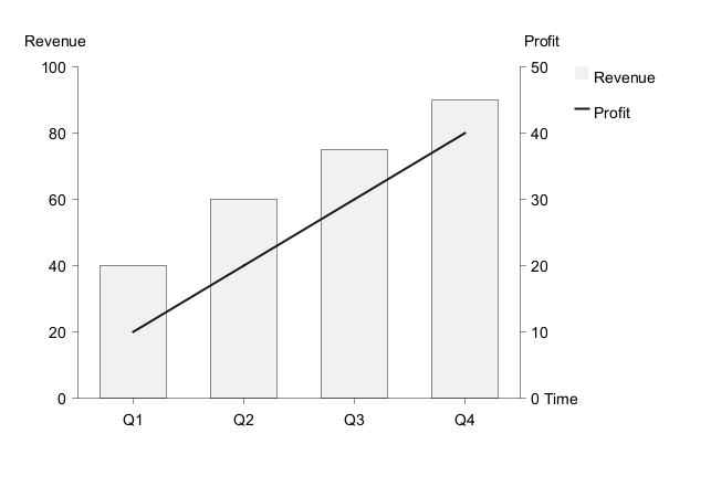
Data Series Options
Series Name
Add a series name for display in the legend: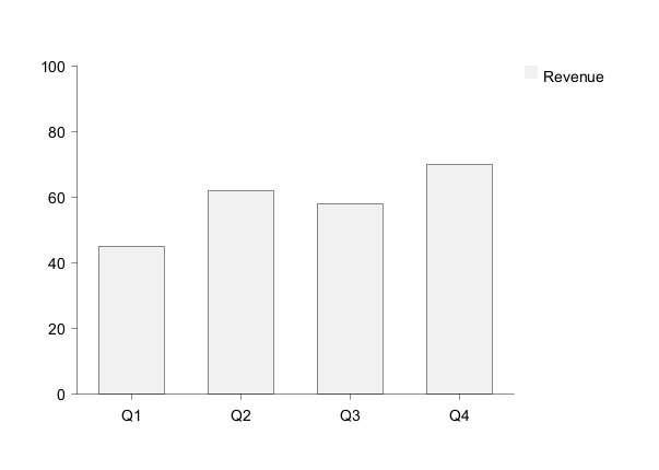
Colors
Specify colors using hex codes or color names: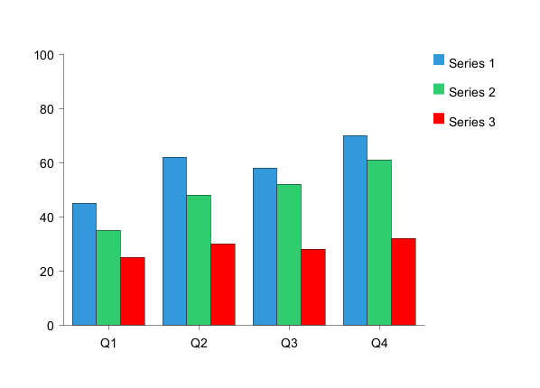
Data Labels
Display values on data points using thelabels keyword:
Layout Options
Legend
Display a legend showing all series: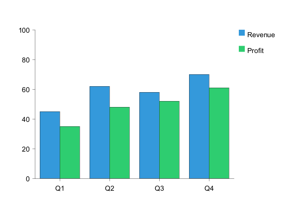
left- Left side of chartright- Right side of charttop- Top of chartbottom- Bottom of chart
Grid Lines
Display grid lines for better readability. Add the optionalgrid keyword at the end of any axis line to enable gridlines for that axis. By default, no grid lines are shown.
Grid on both axes:
grid keyword can be added to:
h-axis- Enable horizontal axis gridlines (vertical lines)v-axisorv2-axis- Enable vertical axis gridlines (horizontal lines)- Major gridlines only are displayed
Annotations
Add text annotations to highlight specific data points:
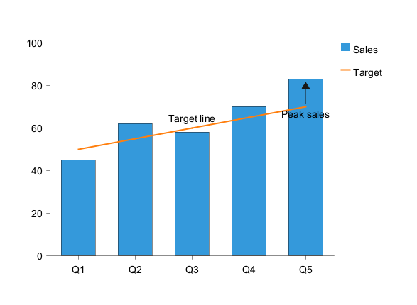
- Text label
- Position coordinates (x, y)
- Optional
<<arrow>>pointing to the data point
Styling
Inline Styling
Apply colors directly to series:
bar "Revenue" [45, 62, 58, 70] #3498db
line "Target" [50, 55, 60, 65] #e74c3c
Style Blocks
Use PlantUML's style system for comprehensive styling: