

New! Render PlantUML diagrams directly inside GitHub
with our official browser extension —
No server. No tokens. No tracking. Zero permissions but clipboard. —
Try it out and let us know what you think!
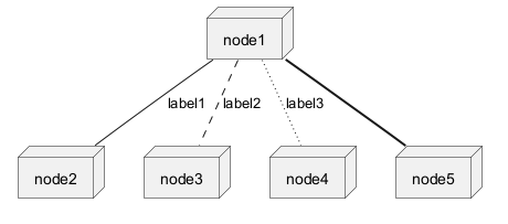
Deployment Diagram
A Deployment Diagram is a type of diagram that visualizes the architecture of systems, showcasing how software components are deployed onto hardware. It provides a clear picture of the distribution of components across various nodes, such as servers, workstations, and devices. With PlantUML, creating deployment diagrams becomes a breeze. The platform offers a simple and intuitive way to design these diagrams using plain text, ensuring rapid iterations and easy version control. Moreover, the PlantUML forum provides a vibrant community where users can seek help, share ideas, and collaborate on diagramming challenges. One of the key advantages of PlantUML is its ability to integrate seamlessly with various tools and platforms, making it a preferred choice for professionals and enthusiasts alike. Edit in Dokuwiki
 Edit in Asciidoc
 Edit in Markdown
 Declaring element
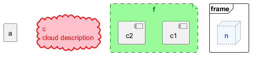
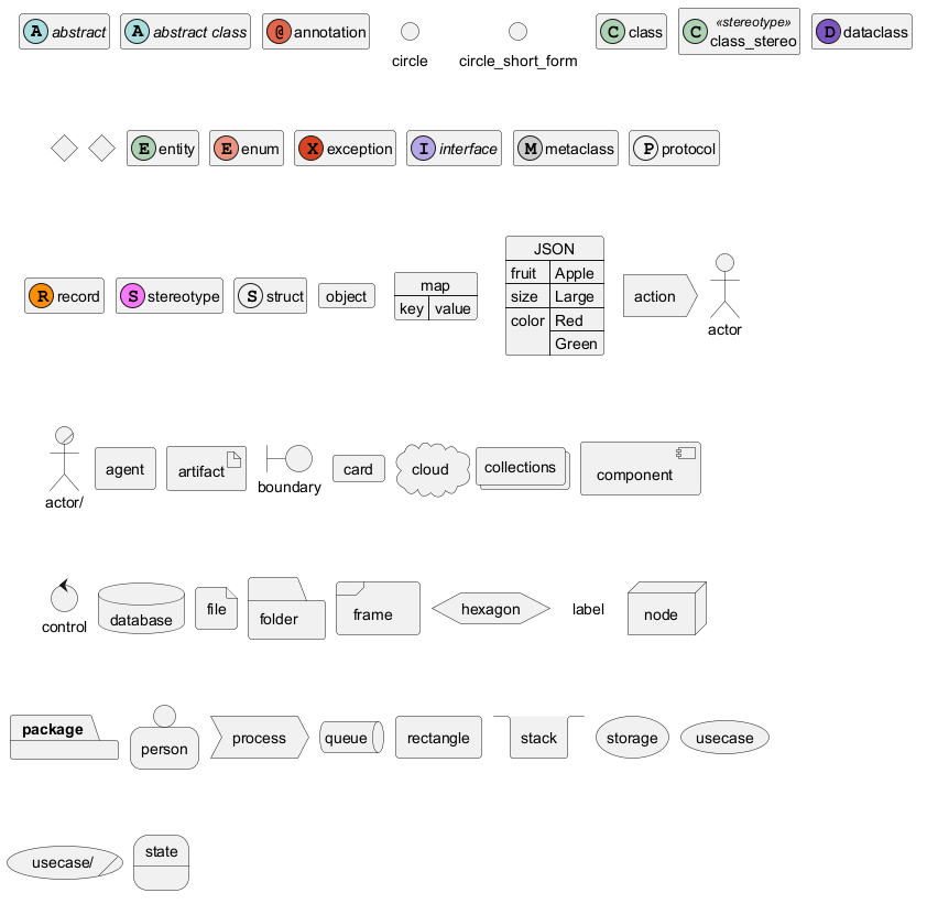
[] for a long description.
Declaring element (using short form)
We can declare element using some short forms.
| Long form Keyword | Short form Keyword | Long form example | Short form example | Ref. |
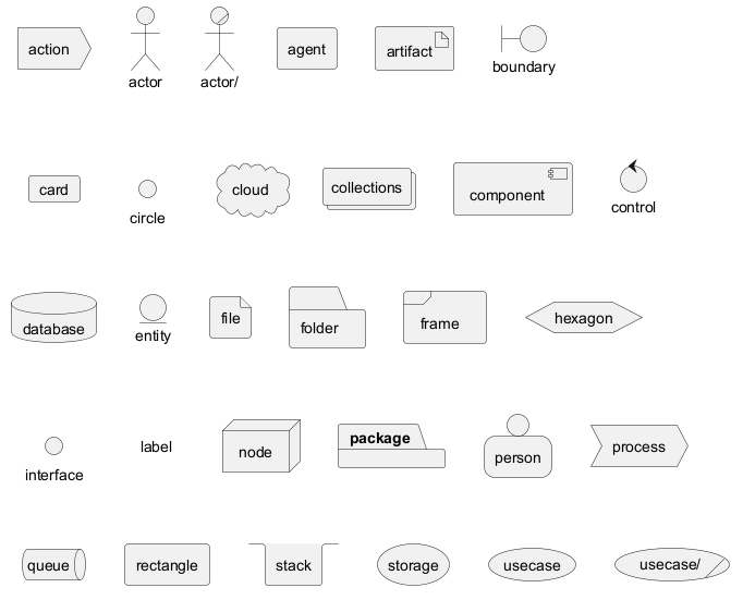
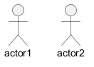
actor
|
: a :
|
actor actor1
|
:actor2:
|
Actors |
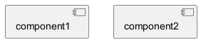
component
|
[ c ]
|
component component1
|
[component2]
|
Components |
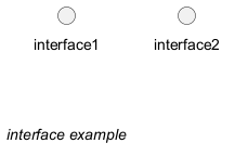
interface
|
() i
|
interface interface1
|
() "interface2"
|
Interfaces |
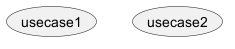
usecase
|
( u )
|
usecase usecase1
|
(usecase2)
|
Usecases |
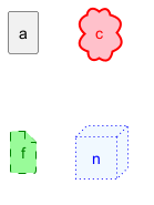
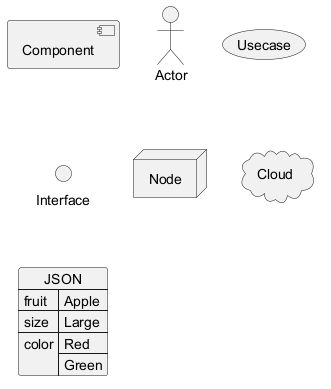
Actor
Component
Interface
Usecase
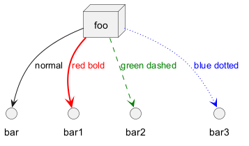
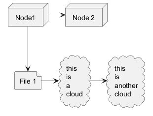
Linking or arrow
You can create simple links between elements with or without labels:
Bracketed arrow style
Similar as Bracketed class relations (linking or arrow) style
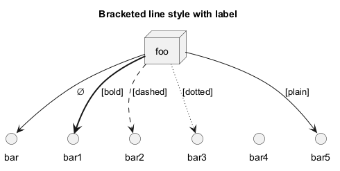
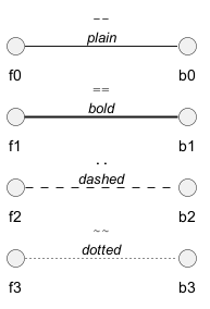
Line style
It's also possible to have explicitlybold, dashed, dotted, hidden or plain arrows:- without label
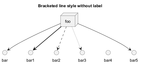
- with label
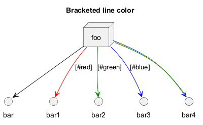
Line color
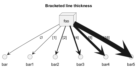
Line thickness
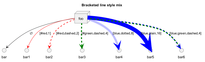
Mix
Change arrow color and style (inline style)
You can change the color or style of individual arrows using the inline following notation:
#color;line.[bold|dashed|dotted];text:color
Change element color and style (inline style)
You can change the color or style of individual element using the following notation:
#[color|back:color];line:color;line.[bold|dashed|dotted];text:color
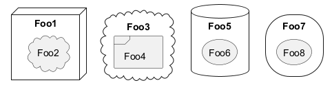
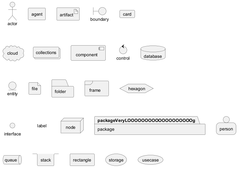
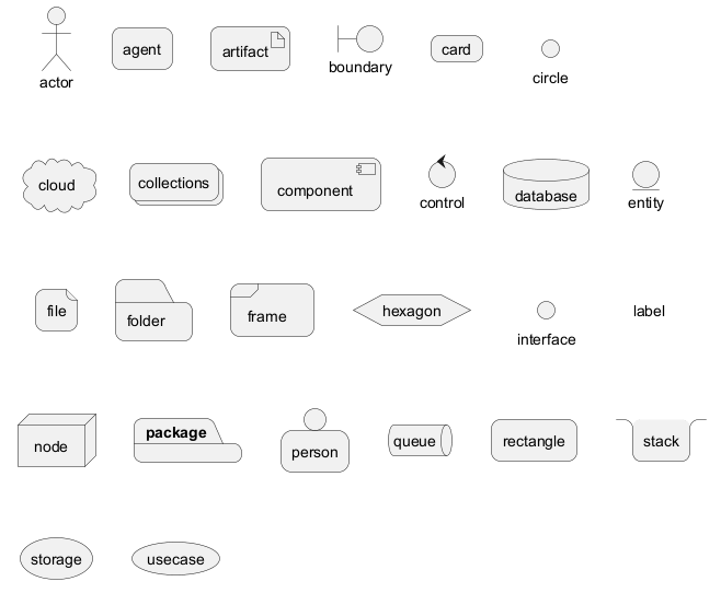
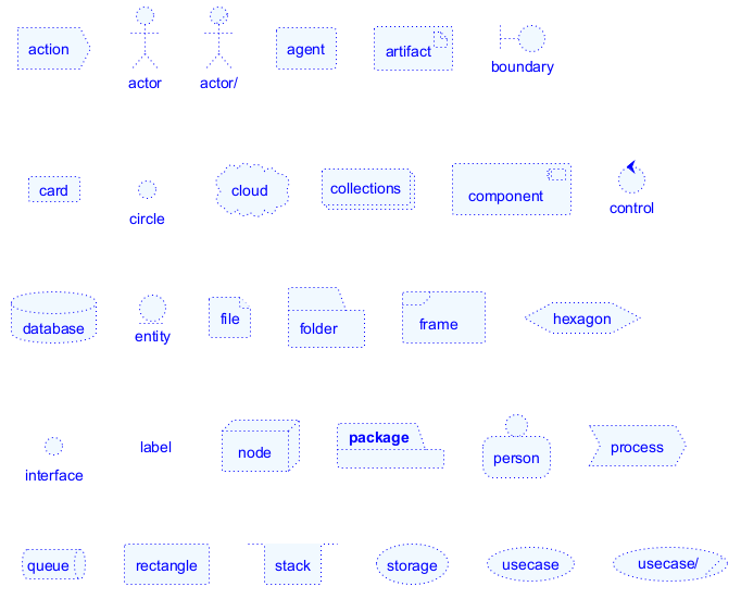
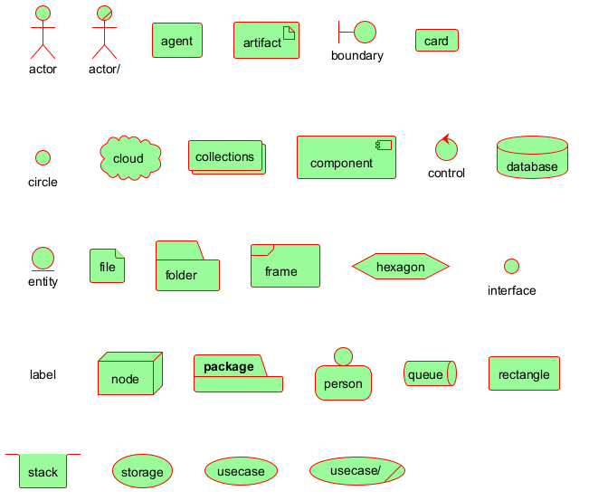
Nestable elements
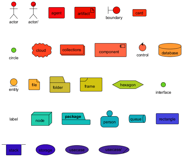
Here are the nestable elements:

Packages and nested elements
Example with one level

Other example
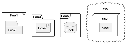
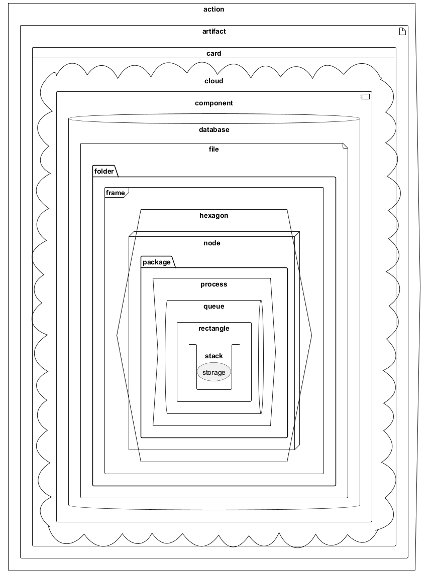
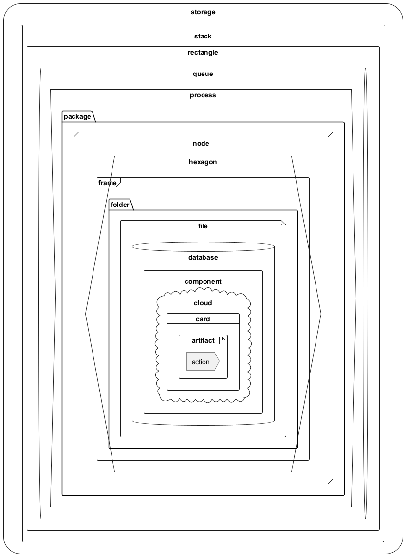
Full nesting
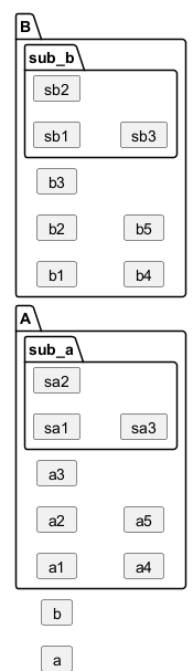
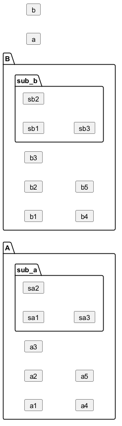
Here is all the nested elements:- by alphabetical order:
- or reverse alphabetical order
Alias
Simple alias with as
Examples of long alias

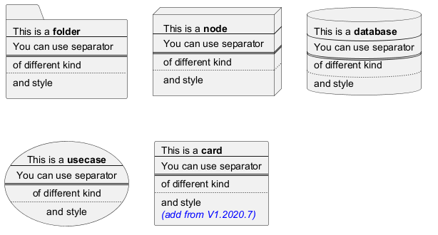
Round corner
Specific SkinParameter
roundCorner
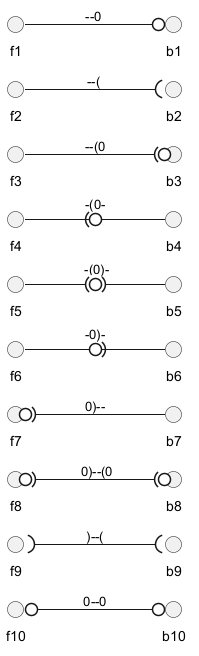
Appendix: All type of arrow line
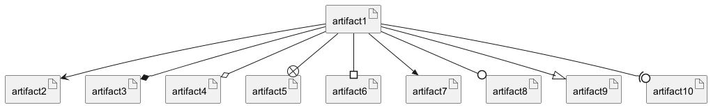
Appendix: All type of arrow head or '0' arrow
Type of arrow head
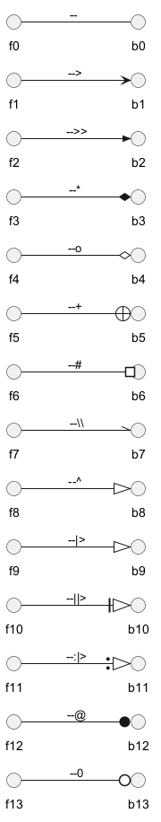
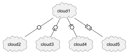
Type of '0' arrow or circle arrow
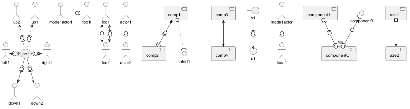
Appendix: Test of inline style on all element
Simple element
Nested element
Without sub-element

With sub-element

Appendix: Test of style on all element
Simple element
Global style (on componentDiagram)
Style for each element
Nested element (without level)
Global style (on componentDiagram)

Style for each nested element

Nested element (with one level)
Global style (on componentDiagram)

Style for each nested element

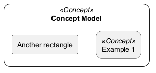
Appendix: Test of stereotype with style on all element
Simple element
Display JSON Data on Deployment diagram
Simple example
Mixing Deployment (Usecase, Component, Deployment) element within a Class or Object diagram
In order to add a Deployment element or a State element within a Class or Object diagram, you can use the allowmixing or allow_mixing directive.
Mixing all elements
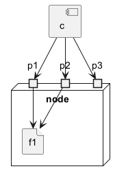
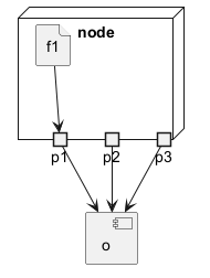
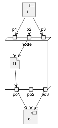
Port [port, portIn, portOut]
You can added port with port, portinand portout keywords.
Port

PortIn
PortOut
Mixing PortIn & PortOut
Change diagram orientation
You can change (whole) diagram orientation with:
top to bottom direction(by default)left to right direction
Top to bottom (by default)
With Graphviz (layout engine by default)
The main rule is: Nested element first, then simple element.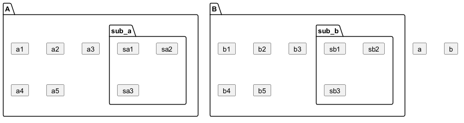
With Smetana (internal layout engine)
The main rule is the opposite: Simple element first, then nested element.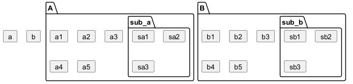
Left to right
With Graphviz (layout engine by default)
With Smetana (internal layout engine)