

New! Render PlantUML diagrams directly inside GitHub
with our official browser extension —
No server. No tokens. No tracking. Zero permissions but clipboard. —
Try it out and let us know what you think!
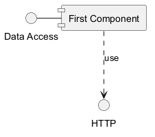
Component Diagram
Component Diagram: A component diagram is a type of structural diagram used in UML (Unified Modeling Language) to visualize the organization and relationships of system components. These diagrams help in breaking down complex systems into manageable components, showcasing their interdependencies, and ensuring efficient system design and architecture. Advantages of PlantUML: Edit in Dokuwiki
 Edit in Asciidoc
 Edit in Markdown
- Simplicity: With PlantUML, you can create component diagrams using simple and intuitive text-based descriptions, eliminating the need for complex drawing tools.
- Integration: PlantUML seamlessly integrates with various tools and platforms, making it a versatile choice for developers and architects.
- Collaboration: The PlantUML forum offers a platform for users to discuss, share, and seek assistance on their diagrams, fostering a collaborative community.
 컴포넌트
컴포넌트
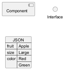
컴포넌트는 반드시 대괄호 [] 로 둘러싸여야 한다.
컨퍼넌트를 정의할때 component 키워드도 사용할 수 있다.
as 키워드를 이용해서 별명을 정의할 수도 있다.
이 별명은 뒤에서 관계를 정의할때 사용된다.
WARNING
This translation need to be updated. WARNING
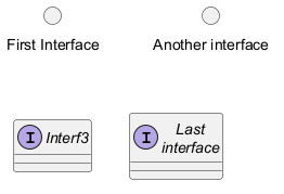
인터페이스
인터페이스는 () 기호로 정의될 수 있다(이 기호가 원처럼 보이기 때문이다).
interface 키워드도 인터페이스를 정의하는데 사용할 수 있다.
as 키워드를 이용해서 별명을 정의할 수도 있다. 이 별명은 뒤에서 관계를 정의할때 사용된다.
인터페이스를 정의하는 일은 선택(optional)이라는 것을 뒤에서 확인할 것이다.
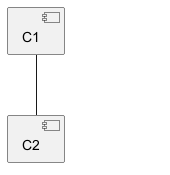
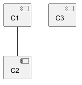
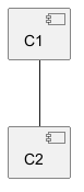
기본 예제
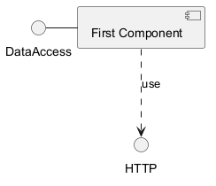
요소들간의 연결은 점선 (..), 실선 (--), 그리고 화살표 (-->) 기호들의 조합으로 생성된다.
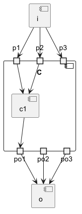
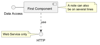
메모 사용하기
각 오브젝트에 관련된 메모를 정의하기 위해 note left of , note right of ,
note top of , note bottom of
키워드들을 사용할 수 있다.
메모는 또한 note 키워드를 통해 단독으로 정의될 수도 있고, 다른 오브젝트들에 .. 기호로 연결된다.
WARNING
This translation need to be updated. WARNING
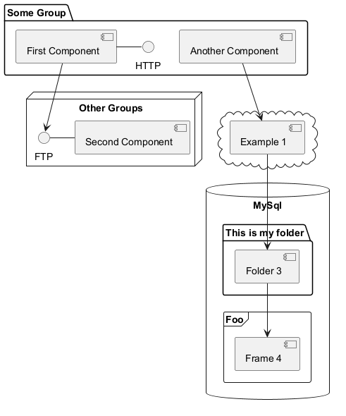
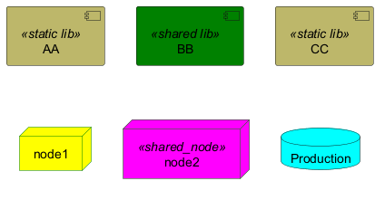
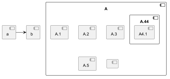
컴포넌트를 그룹으로 나누기
컴포넌트들과 인터페이스들을 그룹으로 나누기 위해 여러가지 키워드를 사용할 수 있다:
packagenodefolderframeclouddatabase
화살표 방향 바꾸기
기본적으로 클래스들간의 연결은 두개의 대시를 -- 갖고 방향은 수직 방향이다.
다음처럼 한개의 대시(혹은 점)를 넣어 수평 방향 연결을 사용할 수 있다:
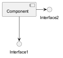
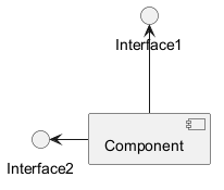
left, right, up, down 키워드를 추가하여 방향을 바꾸는것도 가능하다:
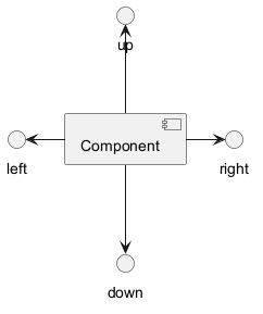
-down- 대신 -d-) 또는 두 글자를 사용해도 된다. (-do-).
이 기능을 남용하지 말아야 한다는 것을 명심하자 :
그래야 별다른 수정없이도 GraphViz가 좋은 결과를 보여준다.
_See also 'Change diagram orientation' on [Deployment diagram](deployment-diagram) page._
Use UML2 notation
By default (from v1.2020.13-14), UML2 notation is used.

Use UML1 notation
The skinparam componentStyle uml1 command is used to switch to UML1 notation.
Use rectangle notation (remove UML notation)
The skinparam componentStyle rectangle command is used to switch to rectangle notation (without any UML notation).

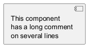
Long description
It is possible to put description on several lines using square brackets.
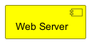
Individual colors
You can specify a color after component definition.
Using Sprite in Stereotype
You can use sprites within stereotype components.
Skinparam
You can use the skinparam
command to change colors and fonts for the drawing.
You can use this command :
- In the diagram definition, like any other commands;
- In an included file;
- In a configuration file, provided in the command line or the Ant task.
Specific SkinParameter
componentStyle
- By default (or with
skinparam componentStyle uml2), you have an icon for component
- If you want to suppress it, and to have only the rectangle, you can use
skinparam componentStyle rectangle
Hide or Remove unlinked component
By default, all components are displayed:

hide @unlinkedcomponents:
- or
remove @unlinkedcomponents:

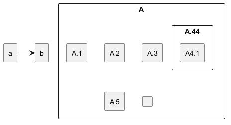
Hide, Remove or Restore tagged component or wildcard
You can put $tags (using $) on components, then remove, hide or restore components either individually or by tags.
By default, all components are displayed:
hide $tag13components:
- or
remove $tag13components:

- or
remove $tag13 and restore $tag1components:
- or
remove * and restore $tag1components:

Display JSON Data on Component diagram
Simple example
Port [port, portIn, portOut]
You can add port with port, portinand portout keywords.
Port

PortIn
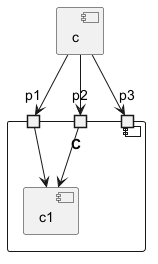
PortOut
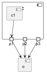
Mixing PortIn & PortOut