


New! Render PlantUML diagrams directly inside GitHub
with our official browser extension —
No server. No tokens. No tracking. Zero permissions but clipboard. —
Try it out and let us know what you think!
Salt (Wireframe)
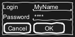
Salt is a subproject of PlantUML that may help you to design graphical interface or Website Wireframe or Page Schematic or Screen Blueprint. It is very useful in crafting graphical interfaces, schematics, and blueprints. It aids in aligning conceptual structures with visual design, emphasizing functionality over aesthetics. Wireframes, central to this process, are used across various disciplines. Developers, designers, and user experience professionals employ them to visualize interface elements, navigational systems, and to facilitate collaboration. They vary in fidelity, from low-detail sketches to high-detail representations, crucial for prototyping and iterative design. This collaborative process integrates different expertise, from business analysis to user research, ensuring that the end design aligns with both business and user requirements. Edit in Dokuwiki
 Edit in Asciidoc
 Edit in Markdown
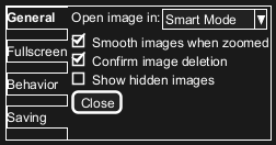
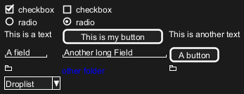
 Basic widgets
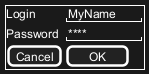
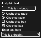
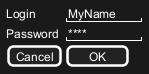
You must use @startsalt keyword.
A window must start and end with brackets. You can then define:
- Button using
[and]. - Radio button using
(and). - Checkbox using
[and]. - User text area using
". - Droplist using
^.
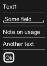
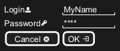
Text area
Here is an attempt to create a text area:
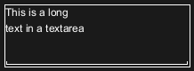
- the dot (
.) to fill up vertical space; - the last line of space (
" ") to make the area wider.
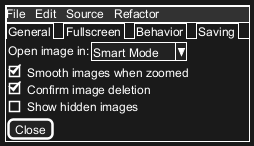
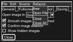
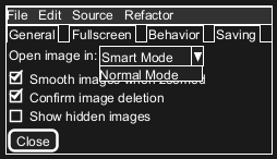
Open, close droplist
You can open a droplist, by adding values enclosed by ^, as:
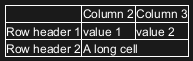
Using grid [| and #, !, -, +]
A table is automatically created when you use an opening bracket {.
And you have to use | to separate columns.
For example:
| Symbol | Result |
#
|
To display all vertical and horizontal lines |
!
|
To display all vertical lines |
-
|
To display all horizontal lines |
+
|
To display external lines |

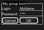
Group box [^]
Using separator [.., ==, ~~, --]
You can use several horizontal lines as separator.
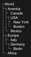
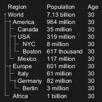
Widget de árbol [T]
Para tener un Árbol, hay que empezar con {T y utilizar + para denotar jerarquía.
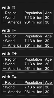
Tree table [T]
You can combine trees with tables.
Enclosing brackets [{, }]
You can define subelements by opening a new opening bracket.
Adding tabs [/]
You can add tabs using {/ notation. Note that you can use HTML code to have bold text.
Using menu [*]
You can add a menu by using {* notation.
Advanced table
You can use two special notations for table :
*to indicate that a cell with span with left.to denotate an empty cell
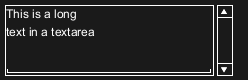
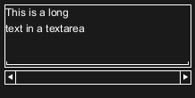
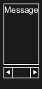
Scroll Bars [S, SI, S-]
You can use {S notation for scroll bar like in following examples:
{S: for horizontal and vertical scrollbars
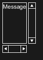
{SI: for vertical scrollbar only

{S-: for horizontal scrollbar only
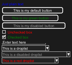
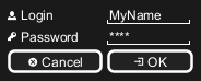
Colors
It is possible to change text color of widget.
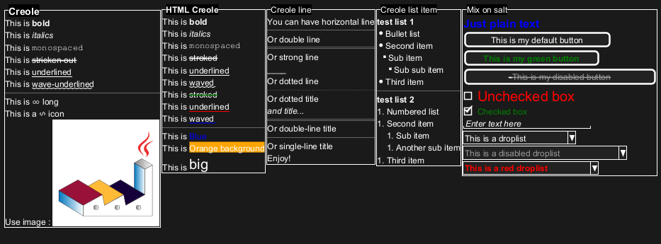
Creole on Salt
You can use Creole or HTML Creole on salt:
Pseudo sprite [<<, >>]
Using << and >> you can define a pseudo-sprite or sprite-like drawing and reusing it latter.
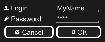
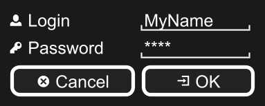
OpenIconic
OpenIconic is a very nice open source icon set. Those icons have been integrated into the creole parser, so you can use them out-of-the-box.
You can use the following syntax: <&ICON_NAME>.
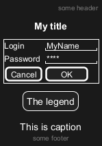
Add title, header, footer, caption or legend
Zoom, DPI
Whitout zoom (by default)
Scale
You can use thescale command to zoom the generated image.
You can use either a number or a fraction to define the scale factor. You can also specify either width or height (in pixel). And you can also give both width and height: the image is scaled to fit inside the specified dimension.
DPI
You can also use theskinparam dpicommand to zoom the generated image.
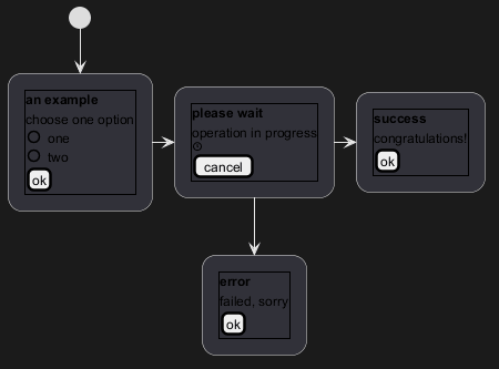
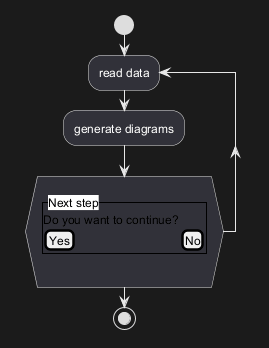
Include Salt "on activity diagram"
You can read the following explanation.

Include salt "on while condition of activity diagram"
You can include salt on while condition of activity diagram.
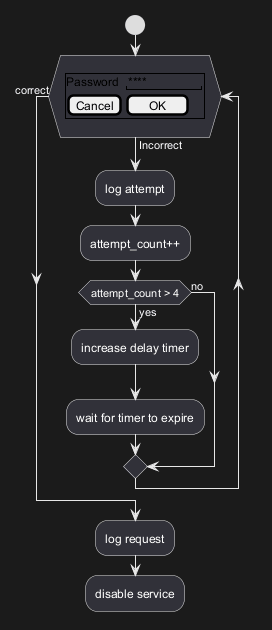
Include salt "on repeat while condition of activity diagram"
You can include salt on 'repeat while' condition of activity diagram.
Skinparam
You can use [only] some skinparam command to change the skin of the drawing.
Some example:

FIXME
🚩
FYI, some other skinparam does not work with salt, as:
Style
You can use [only] some style command to change the skin of the drawing.
Some example:
FIXME
🚩
FYI, some other style does not work with salt, as:
